Domo の自動データフローエンジンを使用すれば、ゲームの視聴者数を予測する際にかかる手動プロセスを数百時間短縮できました。

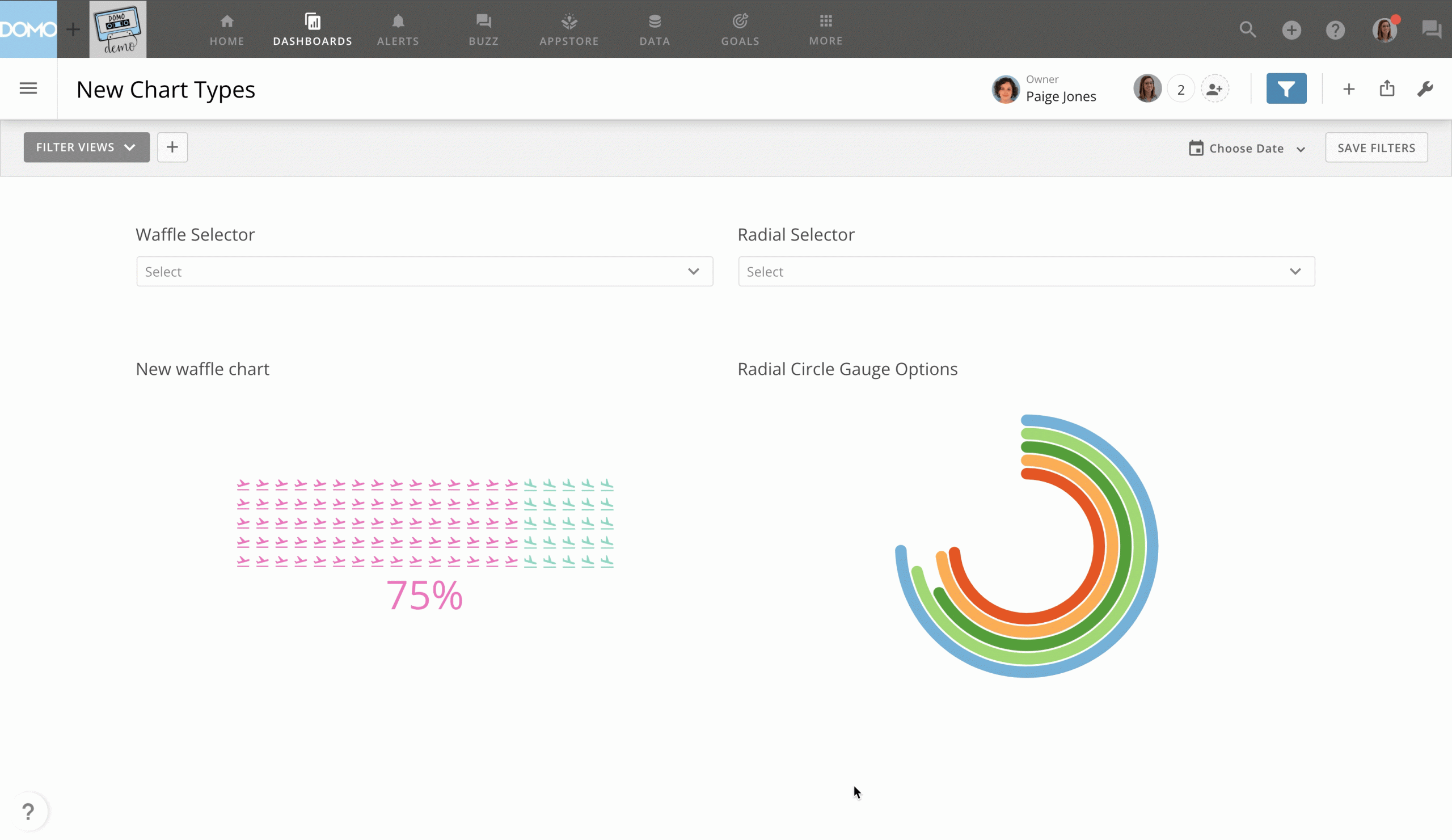
Check out the latest additions to our chart library:
Dropdown control filter charts. This chart type allows you to pick from a large list while not taking up as much space as a radio control or checkbox control card.
Radial gauge and multi-radial gauge charts. With the new circular radial gauge and multi-radial gauge charts, you can easily discover small changes or differences in values—and they don’t take up too much space. These gauges have no x-axis and display data in the y-axis as a percentage of a "Target Value," which is, in general, the maximum value in that axis.
Waffle charts. Waffle charts provide easy-to-interpret comparisons quickly. They’re a useful alternative to pie charts that allow users to display parts of a whole or make relative comparisons. Customize these charts with color ranges, symbols, and optional max values.

Domo transforms the way these companies manage business.


